Apple TV App Store Product Page
1. App Icon
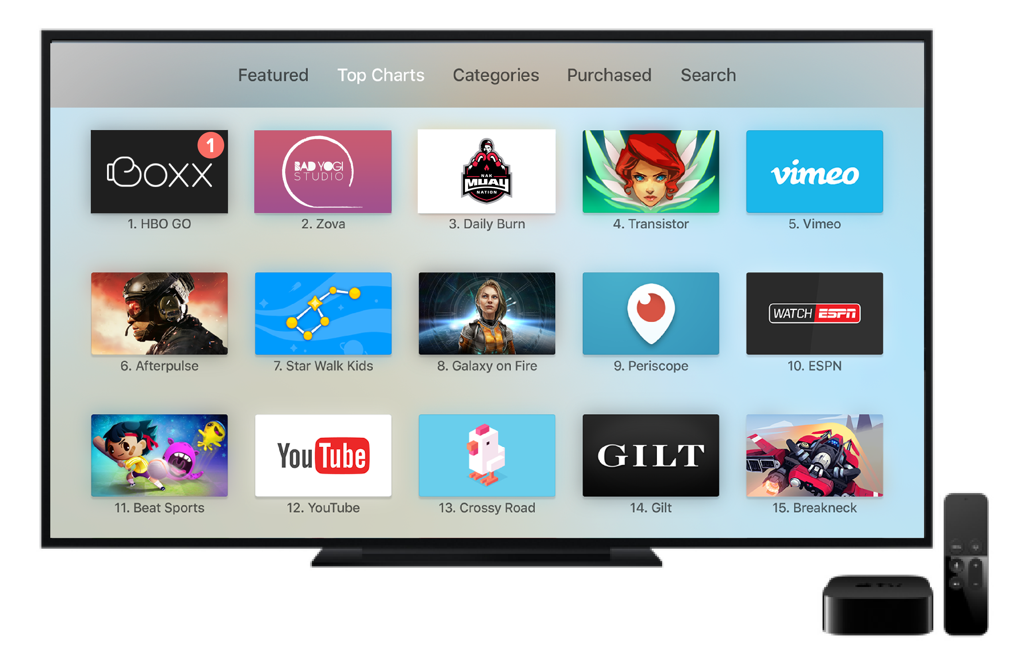
Every app needs a beautiful and memorable icon that attracts attention in the App Store, and stands out on the Apple TV home screen. Your icon is the first opportunity to communicate, at a glance, your app’s purpose.
App icons must have between two and five layers to create a sense of depth and vitality as your icon comes into focus. Use appropriate layer separation so if your icon includes a logo, separate the logo from the background. If your icon includes text, bring the text to the front so it’s not hidden by other layers when the parallax effect occurs.
Although the App Store icon is used differently than the Home screen one, it’s still your app icon. It should generally match the Home screen version in appearance.
For more details, please see here

2. Launch Image
A launch image displays when your app starts up. It appears instantly and is quickly replaced with the first screen of your app, giving the impression that your app is fast and responsive. A launch image isn’t an opportunity for artistic expression. It’s solely intended to enhance the perception of your app as quick to launch and immediately ready for use. Launch images are static, and don’t include layers

3. Top Shelf Image
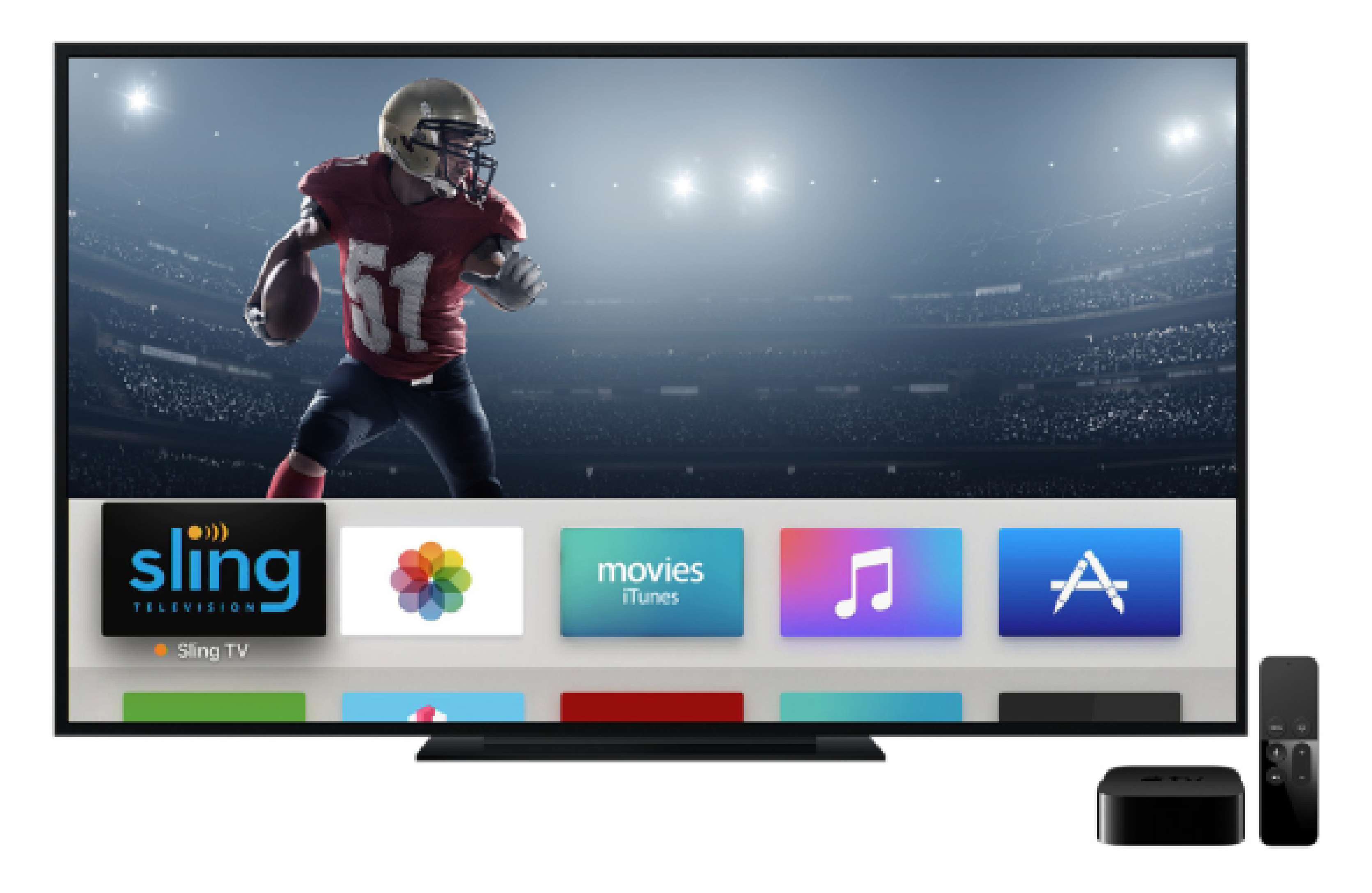
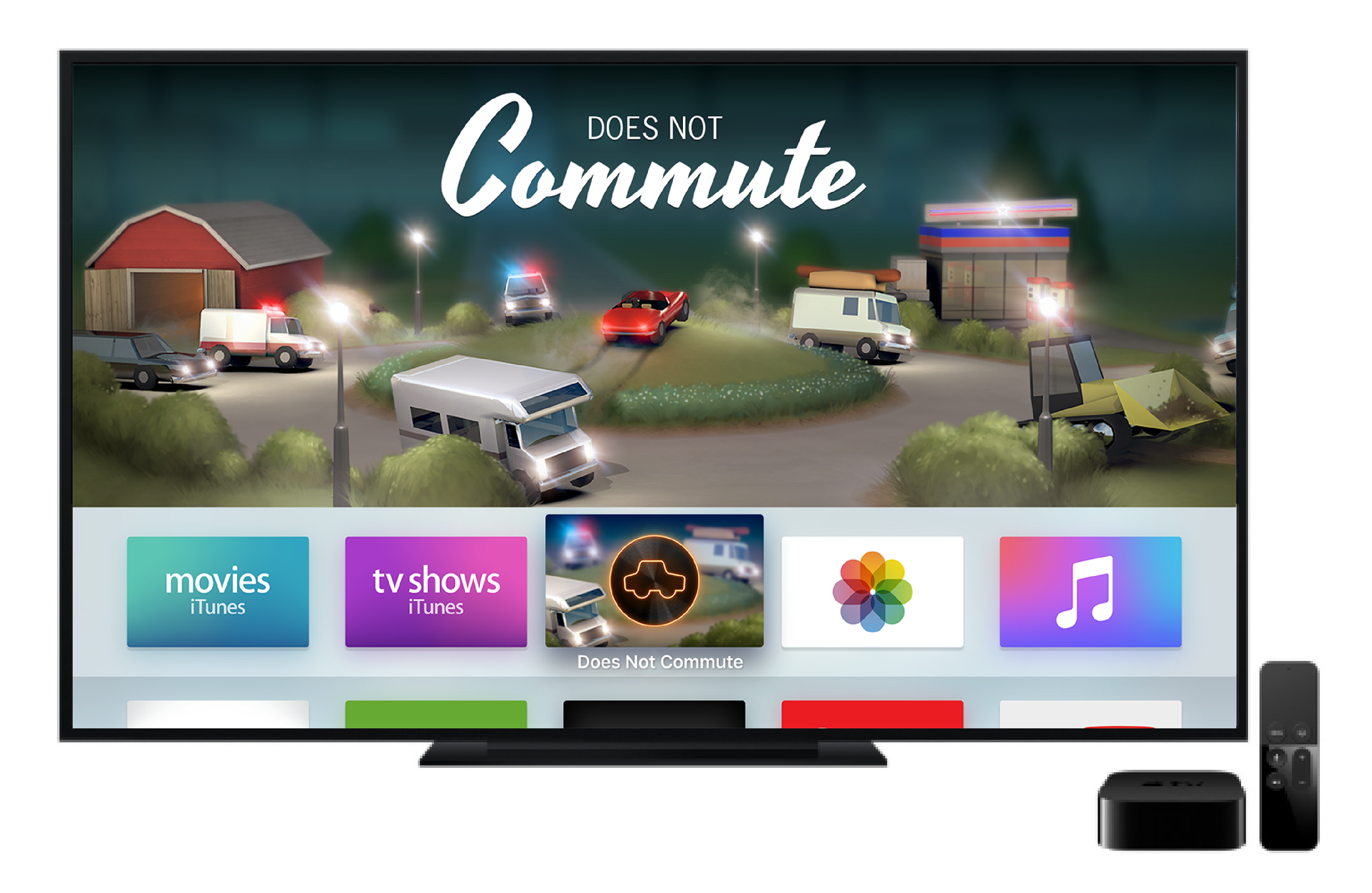
The top shelf of the Apple TV Home screen is a great opportunity for added visibility when the user has placed your app in the top row of the Home screen. When your app is in focus, you can showcase engaging imagery that encourages people to dive into your app for more.
At a minimum, every app must supply a single, static top shelf image that can be displayed when your app is in the top row of the Home screen and in focus.
Top Shelf Image & Extra Wide Top Shelf Image
For more details, please see here


©2018 Vidapp™